
I’m sure it’s no surprise that I love typography. I jump at any chance I get to create designs that boldly feature type. I especially love it when I can do this for logos and visual identities.
I recently completed a project for a family law practice here in New Mexico. The project included a visual identity along with a responsive WordPress website for ASD Dudelczyk Family Law. Kudos to the client for allowing me the freedom to pitch an identity entirely based on typography. Different yet similar to the recent Greenbridge and Evergreen identities, their new logo features the letters ASD in a sleek and professional monogram design.
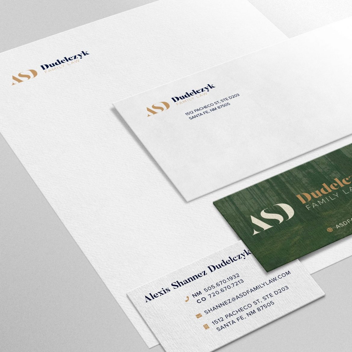
I was able to use a serif type face that I’ve admired for some time. Combined with a tried and true sans serif that I love to use in professional settings, this made a very nice logo and visual identity. The font system works very well for headlines and body copy, and the color system we ended up with is inspired by nature and evokes a sense of calm. The stationery package including letterhead, business card, and #10 envelope all work together incredibly well using this logo.
Again, kudos to this client for being a pleasure to work with, trusting my design sense, and ending up with a beautiful visual identity and sleek, modern, and professional website. If you need a visual identity and responsive WordPress website, let’s get in touch and see where it goes.